Menu toggle menu
 - I. de Jong

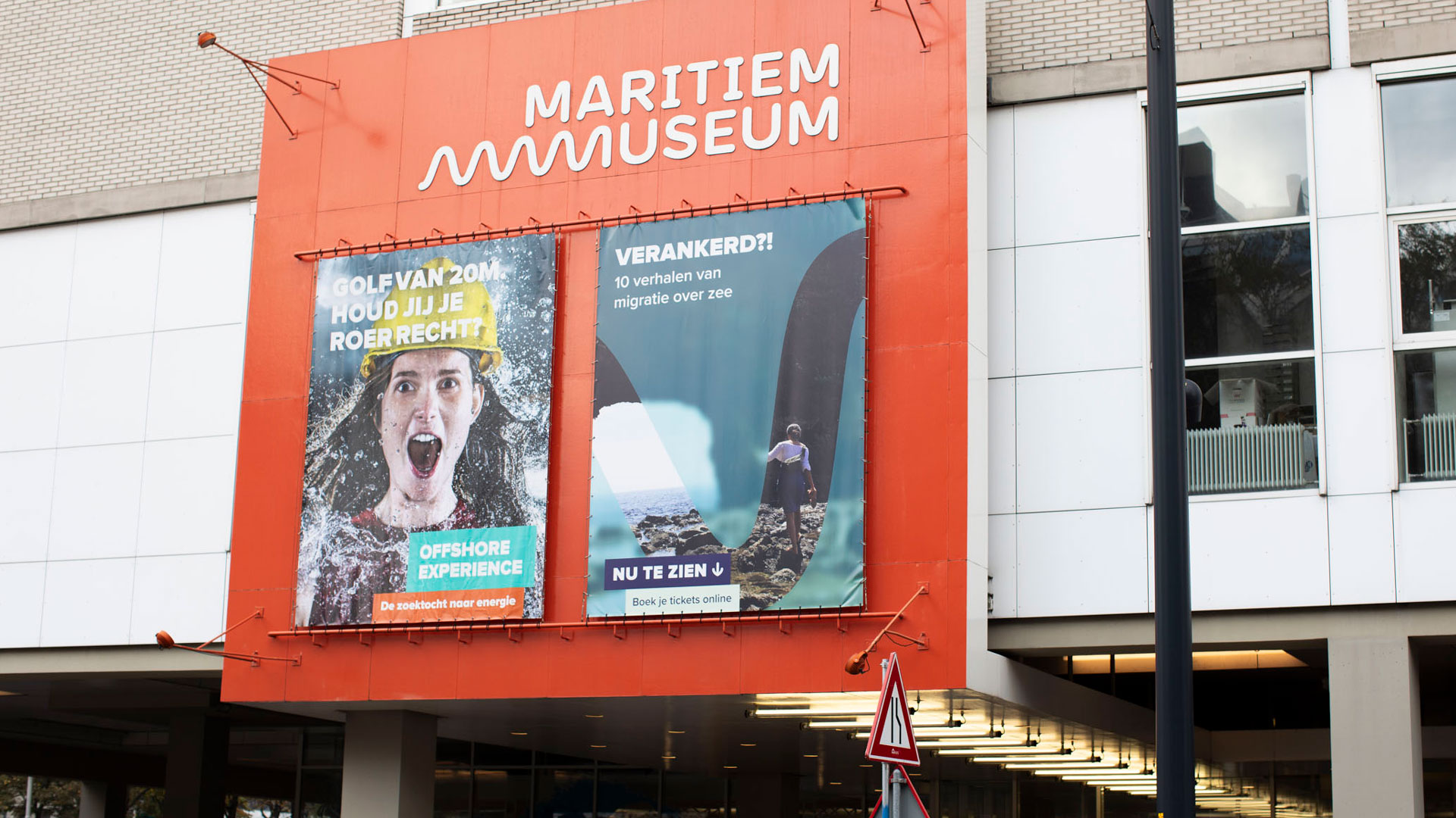
Maritiem Museum – Anchored?!

‘Anchored?!’ is an exhibition with personal stories of young creators from Rotterdam. Ten stories of migration across the sea.

Collaborating with XYZ Creative Agency, I created the visual campaign for this exhibition. To provide a sneak peek into the stories, we unveiled images from the exhibition, using lines shaped by the wave in the logo.

Read more
 - I. de Jong

INC. Festival

Five years ago the Dutch government joined the UN covenant handicap. This created a movement towards a society where everybody can participate without question. INC. Festival was initiated by the Dutch ministry of Health, Welfare and Sport to create a moment of reflection and looking forward. The online festival brought young people with and without a disability together to inspire the society with their dreams, ideas and stories.

I did the design and animation for the campaign, social media as well for the visuals of the stage design.

In collaboration with Leene Communicatie | Photography: Erik Fecken en John Dijkgraaf

Read more
 - I. de Jong

VAPING. IT MAY SEEM HARMLESS, BUT IT DEFINITELY IS NOT.

Trying even once is already harmful; there is no innocent experimentation with nicotine. I created a set of illustrations to clarify the issues associated with vaping for the Trimbos Instituut.

In collaboration with WeFilm

Read more
 - I. de Jong

VALO

Valo, once identified as a technical live streaming party, sought a new branding to discard that image. The new identity shows their full-service approach and offering online events from coaching and production to the live stream itself.

I handled the design aspect, including branding, logo, t-shirts, documents, and car graphics. Additionally, I provided art direction for the website and animation, which were executed by LevelLevel and Michiel de Graaff. 

Read more
 - I. de Jong

Tech Noir

Tech Noir is an eighties-inspired restaurant and club in the city centre of Rotterdam. I was asked to do the design for their events, socials and menus. The designs are highly inspired by the typical design style that characterized the eighties. And with the grid in the design, I made a recognizable element that gave room to experiment with the style for each different event.

Logo design by WOAU.

Read more
 - I. de Jong

Shortcutz Music Video Challenge

The coolest Dutch Production Houses and exciting Dutch musicians push the limits of their creativity to create a music video from scratch in 6 days. I made promotional material to showcase the artists, directors, jury members and to explain the general idea. 

For the logo of the competition I created a black and white logo which represents the competion element and is inspired by the parental advisory icon. The logo is also the base for all the communication; the horizontal boundary extended to create placeholders for images or videos above and below. These placeholders are used to show collaborations, competition and  persons with their work. 

Read more
 - I. de Jong

The Comedy Edition

Campaign to attract pupils to apply for a traineeship about comedy and art. One poster communicates the abbreviation for humor and art; HA. In a line of posters it will form a laugh, the more posters the greater the laugh. The headlines on the posters speaks directly towards the pupils: ‘Do you know how the make the funniest meme?’. The posters where spread in places like high schools and libraries.

Read more
 - I. de Jong

SOOF Ice cream & more

For the Almere base ice-cream parlour called Soof we developed the complete branding and campaign. The design has a high-end feel, but is still colourful. We gave the whole branding a personal touch by communicating in first person, even though nobody in the shop is called Soof (which is a Dutch name).


Read more
 - I. de Jong

Publication

For a publication named ‘De Taal van de Toeschouwer’ I did the design. It is about the role of the spectator in theatre. I designed several title pages which are a combination of specatators and the title becoming part of the audience.

Writers: Tobias Kokkelmans, Marieke Dijkwel and Simone van Hulst
Print run: 200

Read more
 - I. de Jong

Studio Nest rebranding

An upholstery in Rotterdam needed some tweeking in their branding. So the logo is based on the old one and has an adaptive nature, so it can be used in all kind of colors, which you can see on the postcards and flyer. Also I did the studio photography of some furniture.

Read more